import seaborn as snsVisualising data
The de facto standard plotting and visualisation library for Python is matplotlib. It is incredibly versatile and it is worth getting to know. However, its API can be a little complex and can require a fair bit of code to get plot looking how you want.
There are libraries which build on top of matplotlib to provide a nice interface, while still allowing you to peek beneath the surface to access the full power of matplotlib. We’ve seen that pandas can do some plotting directly from DataFrames and we’ll look at another in this chapter, the popular seaborn library.
seaborn
The built-in pandas plotting we saw earlier is really useful because it is always available at your fingertips and it smooths over some of the tricky parts of matplotlib, but it will only take you so far.
seaborn is a third-party library which provides an easy-to-use interface for plotting tabular data which integrates with pandas really well. By convention it is imported as sns:
seaborn comes with its own style which affects the colours, grid, fonts etc. You don’t have to use the seaborn theme but it generally looks nicer than the matplotlib defaults:
sns.set_theme()Note, in versions before seaborn 0.11 this function was called sns.set(). If you are running an older version you will need to use that form.
Once you’ve done this, you’re all ready to get started. So let’s grab some data and start thinking about what we might want to plot. We’ll use the “tips” data set from before as it’s got some interesting features in the data for us to explore:
import pandas as pd

tips = pd.read_csv("./data/tips.csv")
Before diving in, it’s worth thinking about what kinds of plots we can do and what kind of information we want to show. When communicating your results to an audience you should consider the story you are trying to tell. Not story in the “fiction” sense but story in the “narrative” sense. Visualisations should be used to discover and back up conclusions and so the choice of what you show, as well as the choice of what you don’t is important.
There are three major kinds of visualisation that you may want to use:
- Plotting relationships between variables in the data set
- This is showing how a change in one variable affects another variable. For example it could be scatter plot of how age and weight are related or a line plot of the change in temperature over time.
- Plotting the distribution of variables
- This is usually about how many of each value you have and how they are spread out. For example it could be a histogram of the spread of marks for a class of students or the ages of people in a country.
- Seeing how the data varies by category
- Categories in your data can be used in conjunction with both the methods described above but sometimes splitting your data by category and looking at each separately is a good choice. For example it could be a bar chart of how much each country spent on foreign aid.
Plotting relationships
We’ll start with looking at how we can visualise how data are related to each other. seaborn offers a generic interface for doing this called relplot(). You can find more information in the seaborn documentation for the relplot() function and the more general page on visualising statistical relationships.
You use relplot() by passing it the DataFrame you want to explore and the two dimensions of the table that you want to compare. This only makes sense for dimensions that are numerical (e.g. height, weight, price, etc.) and not for “categorical” data like “day of the week” or “species”. The numerical variables in our data are total_bill, tip and size.
The data argument should be the entire DataFrame and the x and y arguments should be the names of the columns to plot. So, to plot the values of tips against the total bill, we do:
sns.relplot(
    data=tips,
    x="total_bill",
    y="tip",
)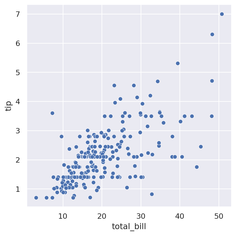
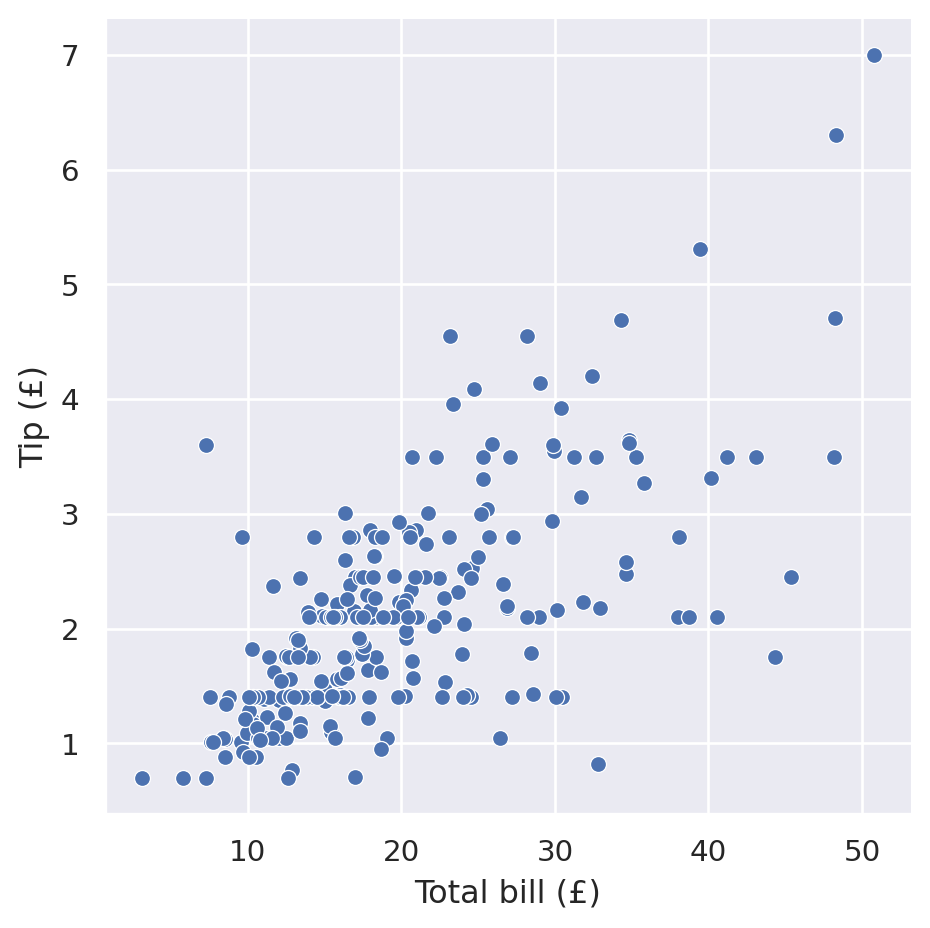
By default it creates a scatter plot and uses the column names as axis labels. To set the axis labels to something more useful, you can call set() on the object returned by relplot():
sns.relplot(
    data=tips,
    x="total_bill",
    y="tip",
).set(
    xlabel="Total bill (£)",
    ylabel="Tip (£)",
)
In the example above we chose two variables from our table of data and used them as a visual dimension in our plot. We wanted the total bill to be represented as the distance from left-to-right and the tip amount to be represented as the distance from bottom-to-top.
seaborn provides a bunch of different dimensions onto which you can map your data:
x=: see abovey=: see abovehue=: assign a different colour depending on the value. If the variable is numerical then it will vary the colour smoothly, if it is categorical then it will assign discrete colours to each category.size=: vary the size of the marker depending on the valuestyle=: use a different marker type (e.g. ▲, ◆, ●, ◼) for the variable. Only makes sense for discrete variables.row=andcol=: for discrete variables, draw a separate subplot along a row or column for each category
If you have multiple dimensions to visualise, you can therefore plot up to 7 dimensional data. Here’s an example using 5 dimensions for different variables:
sns.relplot(
    data=tips,
    x="total_bill",
    y="tip",
    hue="day",
    size="size",
    style="time",
).set(
    xlabel="Total bill (£)",
    ylabel="Tip (£)",
)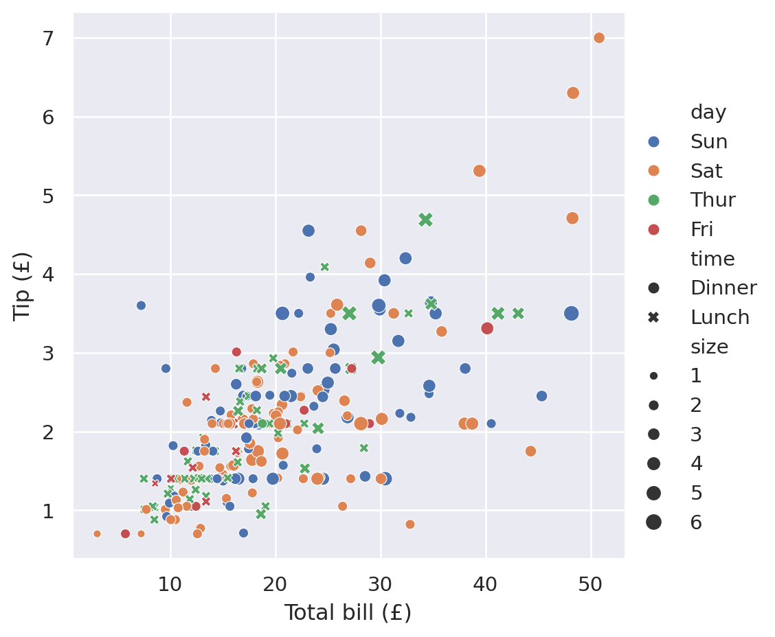
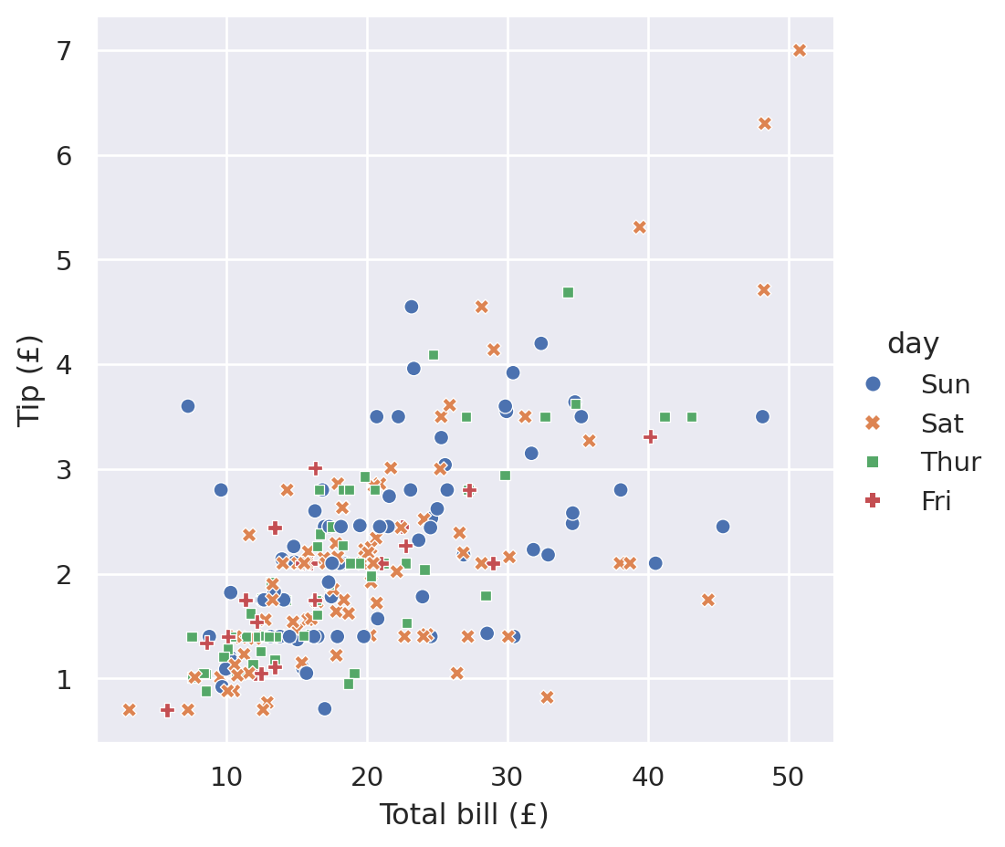
But this very quickly gets very hard to interpret and understand. It is instead recommended to keep the number of variables plotted at once small and instead use the plotting dimensions redundantly, i.e. using both the marker style and the hue for the same data variable. This can make the plot more accessible when printed in black-and-white or when viewed by someone with colour-blindness:
sns.relplot(
    data=tips,
    x="total_bill",
    y="tip",
    hue="day",
    style="day",
).set(
    xlabel="Total bill (£)",
    ylabel="Tip (£)",
)
Plotting distributions
Rather than looking at how one variable relates to another, sometimes you want to see how the data points in one particular dimension are arrayed. As with the x and y axes for relplot, this only makes sense for variables that are numerical.
For example, we might want to get an overview of what kind of values we have for the total bill. We could summarise this down to a few single variables like tips["total_bill"].mean() and tips["total_bill"].std() but this loses a lot of information.
seaborn provides a function for investigating the distribution of a variable called displot which works in a similar way to relplot. You pass the data frame you want to visualise and then start specifying the dimensions that you want to show.
Note: displot was added in version 0.11 of seaborn. If you are on an earlier version then you will not have it available. In this case you should upgrade your version of seaborn to at least 0.11. If you cannot upgrade then you can make histograms using the distplot function (note the extra t), though it lacks some features.
For example, to show a histogram of the total bill, you do the following:
sns.displot(
    data=tips,
    x="total_bill",
)
As with relplot we can ask seaborn to show additional dimensions of our data with the following arguments (which have the same meaning as in relplot): x, y, hue, row and col.
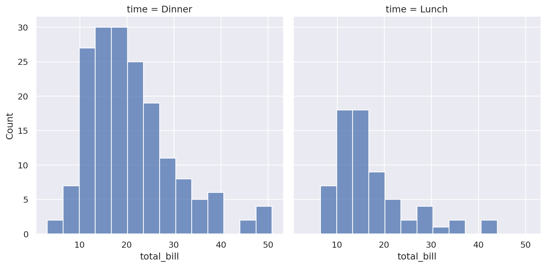
So, to compare the distribution of total bills between lunch time and dinner time, arraying them by column, you can do:
sns.displot(
    data=tips,
    x="total_bill",
    col="time",  # Added this line
)
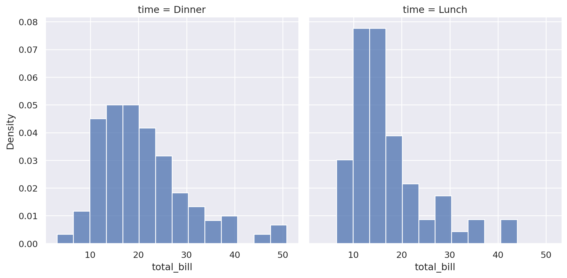
Since displot shows the count of the values in each bin by default, the first thing that you would conclude is that there are more dinner data than lunch. If this is the story you are exploring then it’s all good. However, we want to show how the distribution varies from lunch to dinner. To have it ignore the absolute values of the counts and to instead normalise the counts within each category, you can set common_norm=False which allows each subset to normalise individually:
sns.displot(
    data=tips,
    x="total_bill",
    col="time",
    stat="density",  # Added this line
    common_norm=False,  # Added this line
)
We can now see that the lunch bills have a higher single peak which suggests that it has a tighter distribution. However, plotting them side-by-side makes it difficult to compare the point at which the peak happens in each data set. Do they align or are they shifted?
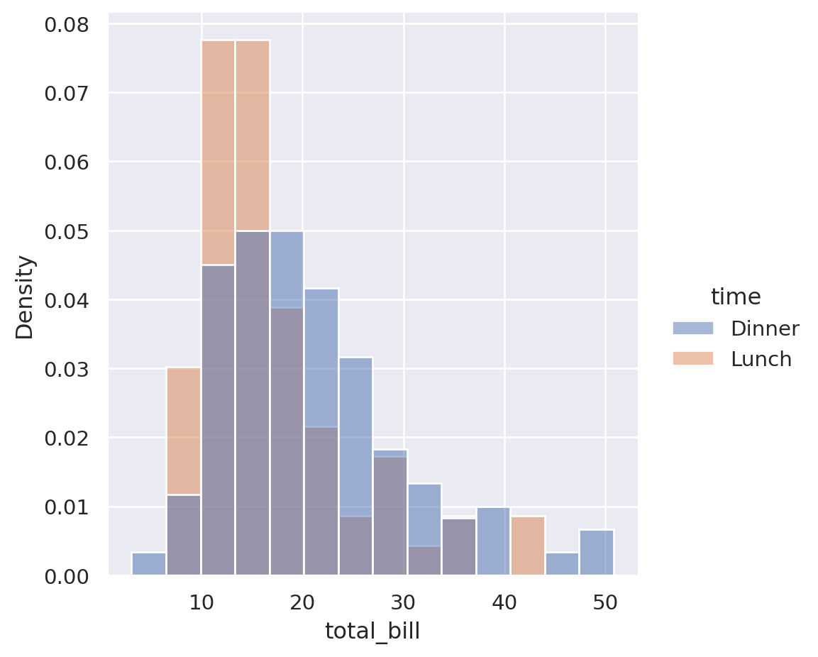
To solve this, we can plot the two overlaid by using the hue semantic instead of the col:
sns.displot(
    data=tips,
    x="total_bill",
    hue="time",  # Changed this line
    stat="density",
    common_norm=False,
)
We can now see that the lunch orders peak at a similar value to dinner but are shifted slightly to the left. They also have a tighter distribution.
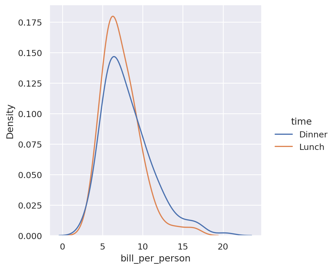
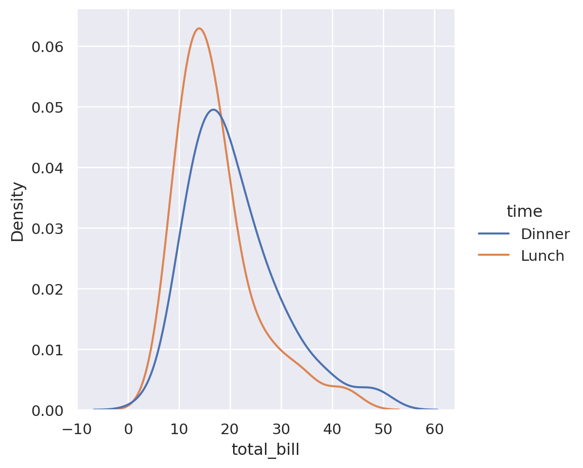
To simplify the view down further, you can smooth the bins by applying a “kernel density estimation” which allows you to turn it into a line graph:
sns.displot(
    data=tips,
    x="total_bill",
    hue="time",
    kind="kde",  # Changed this line
    common_norm=False,
)
Now we can directly see that the lunch peak is tighter and peaks slightly lower.
Plotting categorical data
When you have categorical variables in your data, you usually want to compare between the categories. seaborn’s catplot and the associated tutorial page are the solution here.
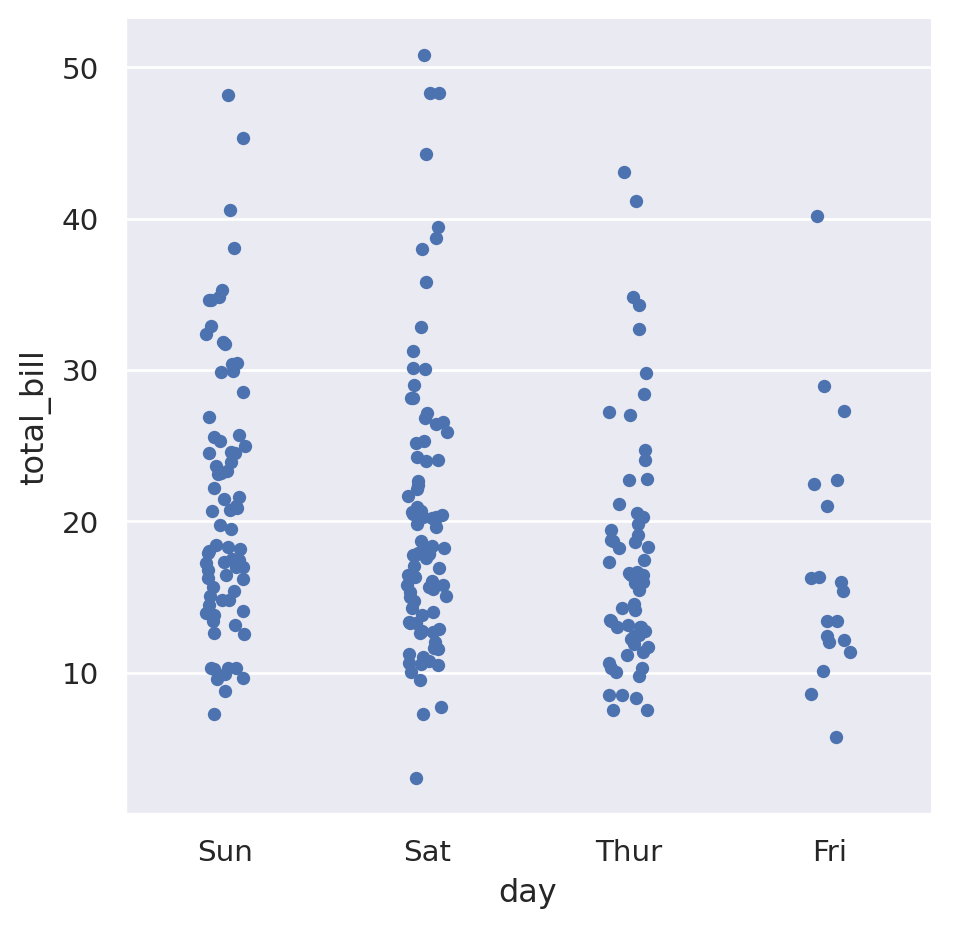
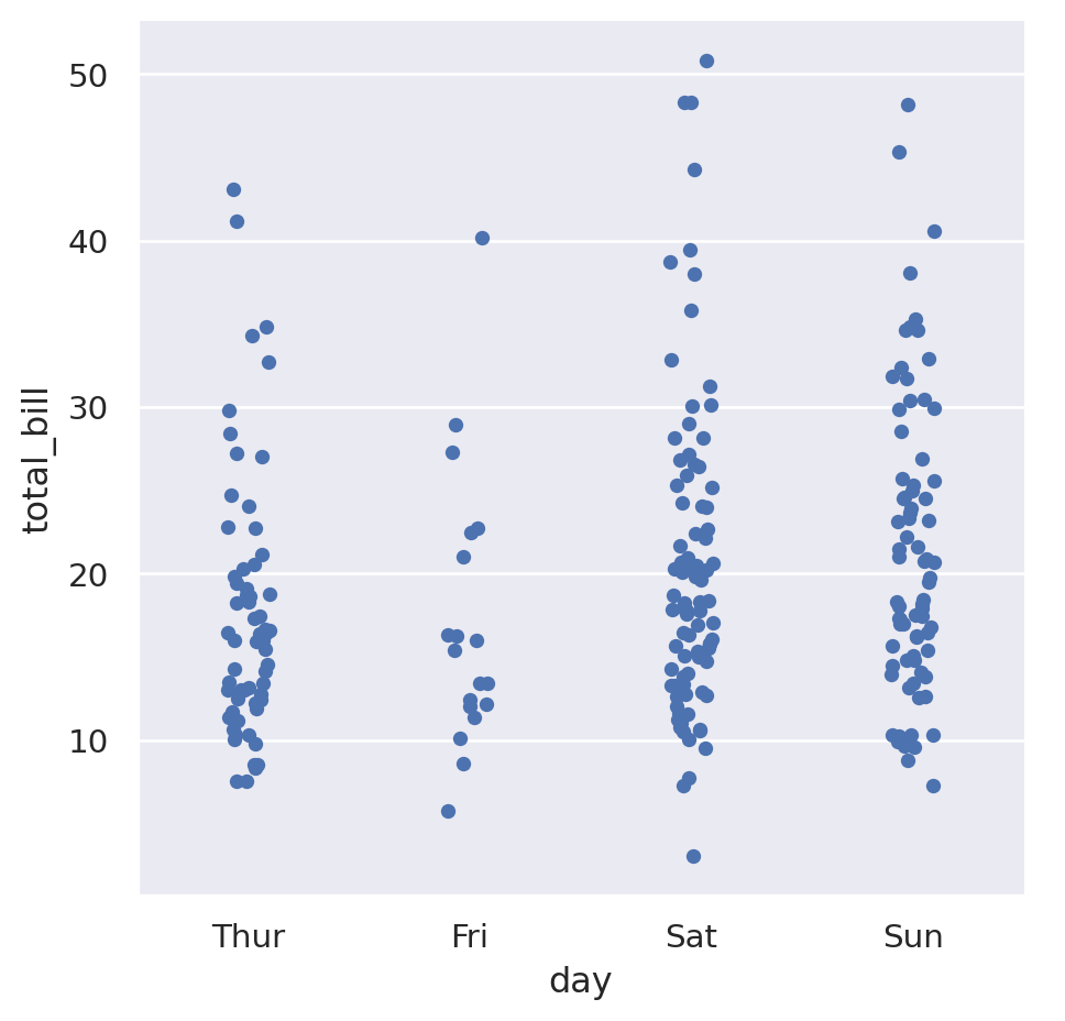
The categorical variables in our data set are day and time. If we wanted to see how the total bill depended on the day of the week, we could do the following:
sns.catplot(
    data=tips,
    x="day",
    y="total_bill",
)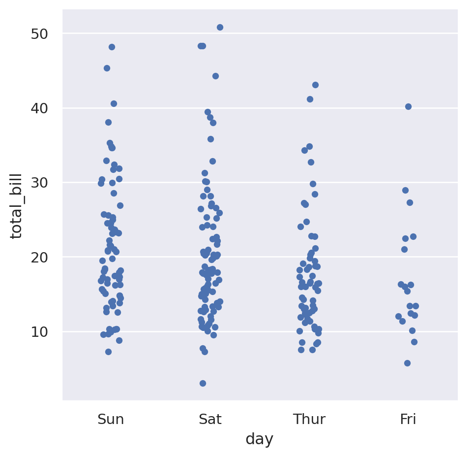
While the day of week is a categorical variable, it also has an understood common ordering to it where we would expect the days to presented in that order. We can specify the ordering with the order parameter:
sns.catplot(
    data=tips,
    x="day",
    y="total_bill",
    order=["Thur", "Fri", "Sat", "Sun"],
)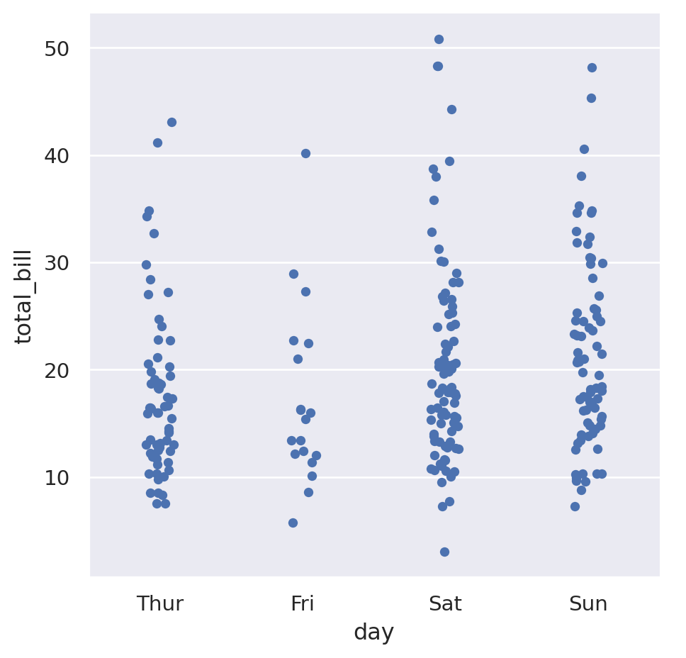
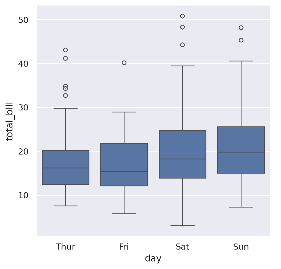
This is showing that it seems like Thursday and Friday have a slightly lower average that the other days. The default “strip plot” is good because it doesn’t summarise the data too much, but when looking for averages something like a box plot might be better. Pass the argument kind="box" to do this:
sns.catplot(
    data=tips,
    x="day",
    y="total_bill",
    order=["Thur", "Fri", "Sat", "Sun"],
    kind="box",
)